The Pantone Color of the Year is an annual tradition that not only highlights cultural trends but also shapes consumer preferences in design and purchasing decisions. Each year, the Pantone Color Institute selects a color that reflects global issues, lifestyles, and emerging trends. Announced every December, the chosen color influences industries from fashion to interior design and marketing.
Pantone’s Color of the Year holds immense significance because it:
Guides Creativity: It inspires designers to think innovatively and remain aligned with evolving design trends.
Influences Consumer Decisions: The selected color impacts buying behaviors across industries, such as fashion, home furnishings, and product design.
Shapes Brand Perception: Marketers leverage the Color of the Year to enhance brand appeal, drive engagement, and boost sales.
In today’s article, we’ll explore the significance of the 2025 color choice and how it continues to influence design and business. Let’s dive in!
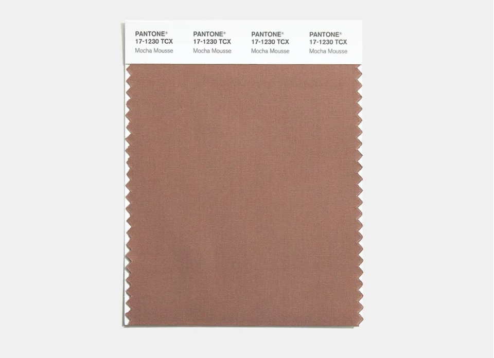
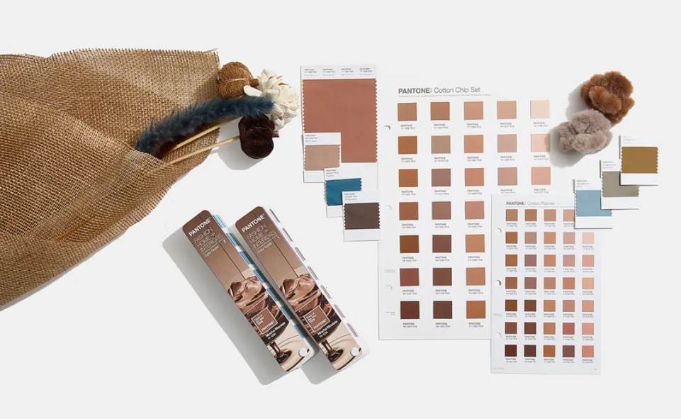
Pantone has unveiled its 2025 Color of the Year: PANTONE 17-1230 Mocha Mousse. This warming brown hue, described as “imbued with richness,” captures the comforting qualities of chocolate and coffee. The Pantone Color Institute stated, “It nurtures us with its suggestion of delectable indulgence, answering our desire for comfort.”

Leatrice Eiseman, executive director of the Pantone Color Institute, elaborated: “Mocha Mousse blends sophistication with luxurious simplicity. It reflects our craving for thoughtful indulgence and everyday pleasures.” The hue’s earthy yet aspirational qualities elevate perceptions of browns from being grounded and humble to embracing luxury and sophistication.
The Pantone Color Institute spends an entire year analyzing trends in fashion, technology, current events, and culture to identify shades that resonate globally. These insights shape the final selection, ensuring the chosen color is both reflective and forward-thinking.
Previous Pantone Colors of the Year
2024: Peach Fuzz A delicate shade between pink and orange, Peach Fuzz evokes kindness, compassion, and connection. It fosters a sense of coziness and optimism for the future.
2023: Viva Magenta This bold, crimson-red hue celebrates resilience and creativity. Inspired by cochineal dye, Viva Magenta bridges the gap between warm and cool tones, empowering self-expression.
Pantone’s choice of Mocha Mousse for 2025 reflects:
Comfort and Harmony: A collective longing for wellness and the joys of shared, simple pleasures.
Connection to Nature: The ongoing desire to align with natural elements and earthy tones.
Cultural Currents: Growing interest in authenticity, mindfulness, and self-care.
Food-Inspired Appeal: A preference for hues with comforting, edible connotations like chocolate and coffee.
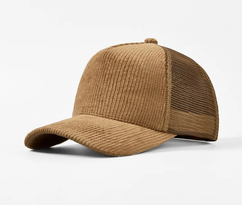
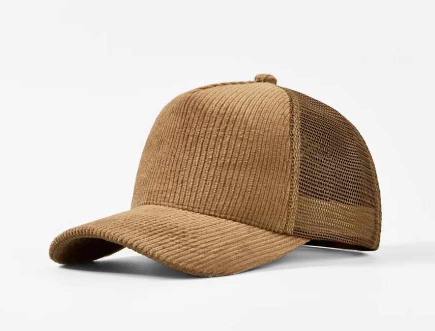
Using Mocha Mousse in hat design is a fantastic way to incorporate this warm, sophisticated color into fashion. Here’s how you can use it creatively:
Fabrics: Opt for luxurious materials like suede, felt, wool, or leather in Mocha Mousse for a rich and elegant look. For casual styles, cotton or canvas can work well in this shade.
Textures: Experiment with textured materials like corduroy, knit, or velvet to add depth to the color.
Mocha Mousse can adapt beautifully to various hat styles:
Classic Wide-Brimmed Hats: Perfect for a sophisticated, timeless vibe. Pair with tonal accents like ribbons or feathers.
Berets: Mocha Mousse can give a chic, Parisian flair. Combine it with subtle embellishments like stitching or small metal details.
Caps and Bucket Hats: Use Mocha Mousse for trendy, casual styles. Add a monochrome logo or embroidery for a modern touch.
Fedoras: This structured design in Mocha Mousse exudes elegance and pairs well with both formal and semi-casual outfits.

Enhance the versatility of Mocha Mousse by pairing it with complementary colors:
Neutrals: White, beige, cream, or taupe to maintain a minimalist, polished look.
Earthy Tones: Olive green, terracotta, or mustard yellow to create a grounded, natural palette.
Accent Colors: Soft pinks or dusty blues for a subtle contrast, or gold and copper for a luxurious touch.
Contrast Stitching: Add visible stitching in light beige or caramel tones to enhance the design.
Decorative Bands: Incorporate leather or satin bands in complementary colors to give the hat an upscale touch.
Metallic Accents: Use bronze or gold hardware, buckles, or pins to highlight the richness of Mocha Mousse.
Embroidery or Logos: Subtle patterns or minimalist logos in muted tones work beautifully with this color.
Fall/Winter: Use Mocha Mousse in felt or wool hats with cozy details like fur trims or knitted patterns.
Spring/Summer: For lightweight hats, use straw or canvas with Mocha Mousse as an accent or dye, complemented by breathable designs.
Pair Mocha Mousse hats with monochrome outfits for a sleek, cohesive look.
Add accessories in warm tones like gold jewelry or leather belts to tie the look together.
For casual outfits, use the hat as a pop of muted color against denim or light-colored clothing.
By combining its natural warmth with thoughtful design choices, Mocha Mousse can become a standout feature in any hat collection! Would you like specific design sketches or concepts to explore further?
Pantone’s Color of the Year doesn’t just reflect trends—it actively shapes them. Here’s how:
1. Trend Forecasting
Pantone’s announcement acts as a starting point for designers, guiding color palettes across industries and providing inspiration for upcoming collections and products.
2. Brand Relevance
Incorporating the Color of the Year into branding signals that a company is attuned to current trends. This alignment enhances consumer perception of relevance and innovation.
3. Product Development
From clothing to electronics, businesses introduce products in the featured color to appeal to trend-conscious consumers, creating new opportunities for growth.
4. Marketing Inspiration
The Color of the Year inspires creative direction in advertising, website design, and social media campaigns, helping brands stand out and connect with their audiences.

As design evolves, color trends are increasingly influenced by societal and technological shifts. Key trends to watch include:
1. Sustainability and Nature
Earthy tones, such as Mocha Mousse, reflect a growing emphasis on sustainability. Colors inspired by natural elements resonate with eco-conscious consumers.
2. The Rise of Digital Hues
Bright, neon tones are gaining traction in tech-driven spaces like Web3 and the metaverse. For example, purples—associated with luxury and cyberspace—are becoming dominant in virtual branding.
3. Captivating Tinted Darks
Deep colors, like charcoal, espresso, and plum, offer elegance and depth, while softer browns and pinks provide a sense of security and warmth. Expect these shades to appear in wall paint, furnishings, and accessories.
4. AI and Data-Driven Color Choices
The integration of artificial intelligence in color forecasting allows for more precise predictions. AI-driven insights may continue to influence Pantone’s choices and industry-wide trends.
Complementing Mocha Mousse, brands like Glidden and Little Greene are also leaning into rich, inviting hues, such as Purple Basil and Mochi—further reinforcing the trend toward comforting, luxurious tones.

Pantone’s Color of the Year is more than just a shade; it’s a cultural phenomenon that influences design, marketing, and consumer behavior. For 2025, Mocha Mousse encapsulates our collective longing for comfort, indulgence, and connection to nature.
What are your thoughts on Pantone’s 2025 Color of the Year? Do you think Mocha Mousse will dominate design trends, or do you foresee another hue taking the spotlight? Share your predictions in the comments below!
While we await Pantone’s official reveal, incorporating predicted hues like Mocha Mousse into your projects ensures you’re ahead of the curve. Whether through paint, decor, or branding, thoughtful use of these trends can create timeless and inviting spaces.
That’s all for today! Have questions? Let us know in the comments! Stay tuned for more updates on design trends and inspiration!
From https://www.pantone.com/color-of-the-year/2025